We're excited to be including new article rich layouts in this week's release.
When you see these, you will notice right away that there are some subtle enhancements made to all recaps, previews and any other article rich associated with an event:

- New style for related links so they are presented in more of a mobile-friendly button. This style for the time being will only be present on these article pages.
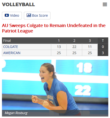
- If your site is currently showing the mini box score on recaps, then you will now see the line score moved and printed large, across the top of the page under your title.
- The mini box score has gotten an upgraded look which will translate well to mobile.
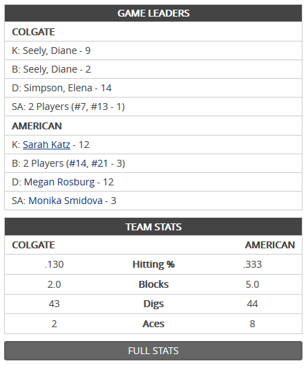
- The mini box score will no longer be dependent on the thumbnail width.
- The date of all stories have been strategically placed in a new location, and updated Facebook like and Tweet buttons have been placed next to it!
- For recaps that have a related video that we host, it will play within the thumbnail area of the recap.
- For recaps that have a related photo gallery, it will now be printed in a cleaner and more presentable manner below the body of the content. Each image can be clicked to be taken to the full gallery page.
It doesn't stop there! You can choose from three different layouts — classic, modern, or standard.
- Classic: We suggest this view if your thumbnail size is around 600 pixels. Your thumbnail will be aligned along the left side of the page and your mini box score side bar will slide up along the right side. We feel like that 600 pixels left column is an adequate amount of space to open things up!
- Modern: This view really helps out all of those newer launches that went with the page-wide thumbnail size. Setting up the modern view will now let you display that amazingly large photo across the entire width of the page, directly beneath your related links and title.
- Standard: This is what all sites will be set to on the launch of these new views, so no layout changes for anyone! It is what you have always had along with the system-wide changes mentioned above.
The really cool thing too is that not only are these new ways to show your desktop layouts, but you are now getting mobile-friendly mini boxscores for recaps!
How to set this up
Several users who went through a site launch starting this summer have been anxiously awaiting to use these for their recaps as many launches were built with these new layouts in mind. That being said, these new layouts can be taken advantage of all by all sites immediately by setting up your site-specific Options file!
You are able to add any of those views within any Options file in your site. If you want to update all article riches on your site, you can add the view of your choice to the root directory Options file. You can also add it to specific sport Options files to get sport pages looking their own unique way!
Get a sneak peak
Below is a gallery of how lots of new options can display on your site to give you a better idea. Before we get to them though, I wanted to make sure to lay out the rest of the options you have to work with.
If you aren't a fan of any of the automatic enhancements, add the following options and set them to false to return back to how it was:
- Article view: banner score
- Article view: show related video
- Article view: show tweet button
If you want to play your related PrestoSports or YouTube video overlaying the page, add in the option for Article view: play video as overlay.