50 Shades of Mobile
November 6, 2013 by Greg BlakeWe're happy to share that we're moving towards fully responsive designs, a move that will keep us ahead of the game in 2014 and beyond when it comes to mobile development.
At our annual trips to MobileUX Camp DC, we have been able to discuss the evolution of adaptive vs. responsive design with professionals from a variety of industries. It has been fascinating to discuss the challenges of these techniques with experienced web designers and developers, and ultimately it confirmed our decision to transition over to fully responsive designs.
When weighing the pros and cons of adaptive design and responsive design, the key advantage of responsive that convinced us it is best is that it's much better suited for the future. A responsive site is set up to give your fans the best experience possible on any device, even one that has yet to hit the market!
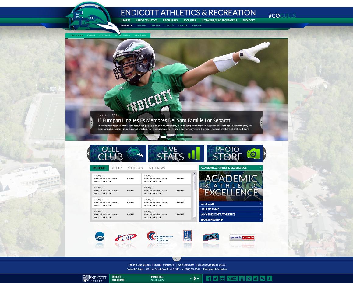
"When Endicott made the decision to redesign and go responsive, we based it on our traffic stats," said Jeanne Commette, Director, Web Development at Endicott College. "We had an increase of almost 7% of mobile users in one year, and the shift to mobile is increasing rapidly. I'm pleased that PrestoSports will provide our users with the responsive design flexibility."
(Screen) size matters
In 2009, we launched MobileNow to give users a mobile-friendly experience on smartphones. We built it using adaptive design — all sites could recognize that a mobile device was accessing it and would then display the mobile site instead of the desktop site. That technique worked well when the iPhone was the only mobile device we had to worry about. (Actually we also had MobileClassic for Blackberry, but with that company on the verge of bankruptcy, we're cutting our losses).
Over the past four years though, the market has been flooded with smartphones and tablets with a dizzying amount of differing screen sizes. And at your desk, you can have a laptop or monitor in a wide range of sizes as well.
With that in mind, adaptive design doesn't seem like a viable option anymore. It just doesn't acheive what we feel like is the point of all this: giving fans the best possible experience no matter what device they are using.
And to be honest, there is no telling what "the next great device" will be. So, why not stay ahead of the game with a site that will look good on all devices?
Where do we go from here?
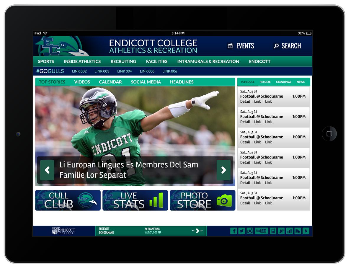
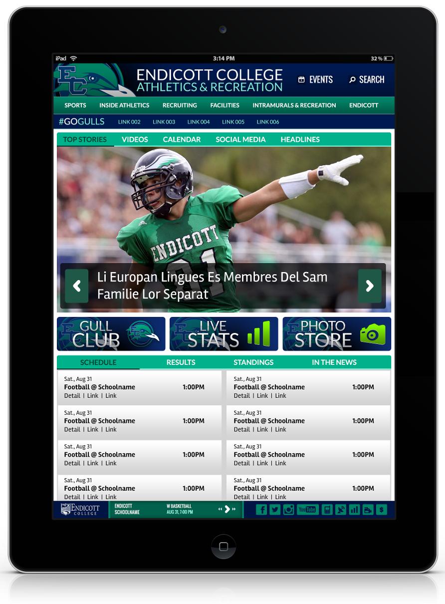
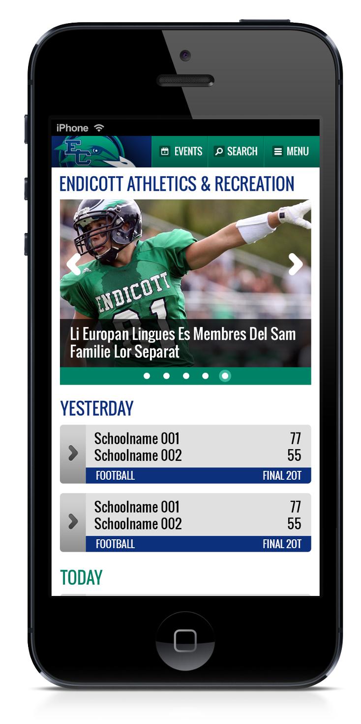
Over the past two years, we have done extensive research on responsive design to determine the best way to approach the development. Athletics sites pose a particular challenge because there are so many information-heavy pages. We have to make sure that your schedule page looks just as good on your new tablet as it does on the 24' monitor on your desk and on your phone.
However, it is important to note that there is a deliberate process which needs to take place to make this change to your site. Therefore, responsive designs will only be implemented through redesigns and new site launches.
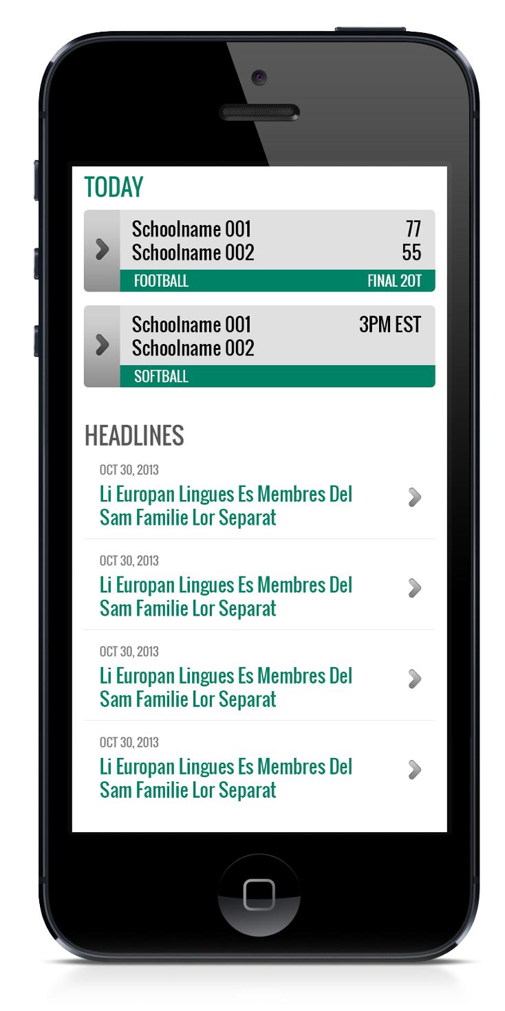
In the meantime, MobileNow is still a viable option. We're not looking to phase it out all at once. In fact, by building responsive designs, we are going to be able to clean up a lot of the internal pages (stats, rosters, bios, schedules, scoreboards, headlines and releases) which will give those pages a much better mobile presence and in essence start to update MobileNow sites.